Welcome to my A2 media coursework blog. My name is Maisie MacGregor (candidate number 0506), and I will be working in group 4 with Molly Sullivan (candidate number 0816), Ellie Brackpool (candidate number 0100), and Mari Leach (candidate number 0440).

To the right of my blog are labels for my A2 Preliminary task, A2 Research and Planning, A2 Construction and A2 Evaluation, and an archive of each individual post. There is also a live link to the Latymer Media Music Video Blog.

Click here to access Group 4's faceboook page.

Thank you for taking the time to look at my blog.

Music Video

Our Music Video

Digipak Front and Back Cover

Digipak Front and Back Cover
Our digipak front and back cover

Digipak Inside Cover

Digipak Inside Cover
Our digipak inside cover

Click on the image to open our website in a new tab

Click on the image to open our website in a new tab

Tuesday 9 December 2014

Creating the website

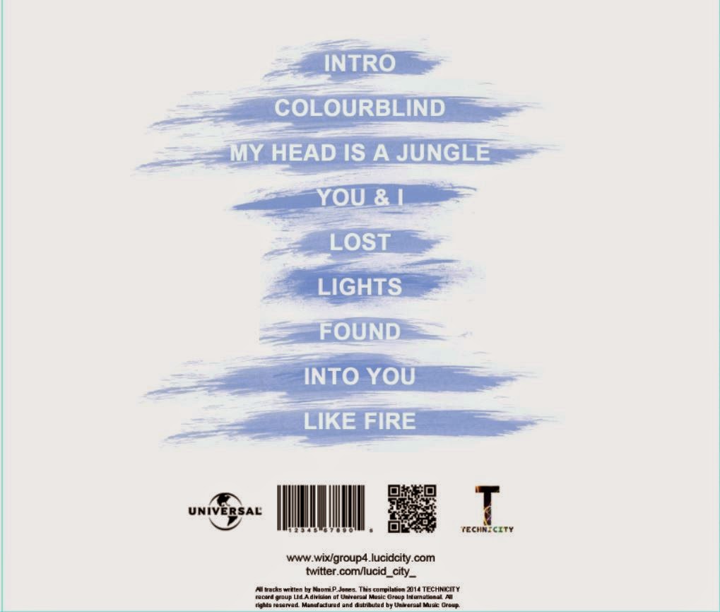
We built the website for the artist using wix.com, starting by inserting the pages and adding each one to the menu across the top of the page.

The pages we decided to include were:
  • Home
  • News
  • About
  • Gallery
  • Music
  • Tour
  • Store
  • Contact 
All of these are conventions of music artist websites across every genre.


The first version of our website looked like this:


The banner for this version was only temporary, as we decided we were going to use a powder paint themed one to be synergistic with our album cover and music video, creating a strong sense of branding for the artist.

Making the banner
To make the banner, we used photoshop to remove the background from two different photos of powder paint we had take ourselves, and layer them on top of each other to produce the image above. We then inserted it into the header of the website. We then added pictures and a social media feed to the homepage. The social media bar is a live link to our artist's twitter and instagram pages, posting all posts to our website as they are posted on social media.

Here is how two pages on our website looked at this point:
Home page
Tour dates page

We reviewed the look of the website as a group, and deciding that we didn't think it looked professional, made some changes. We changed the font and the layout, adding grey bars to the headings of pages and a slideshow of pictures (which link to articles) on the homepage. 
We also received audience feedback on the banner, telling us that having pink as the main colour looked too feminine and didn't represent the artist well. Therefore, we went back onto photoshop and changed the hue of the banner, making the main colour blue.

At this point, the website looked like this:

After this, we added several other features to the homepage, such as 'latest news', a behind the scenes music video, a link to a competition, and a picture advertising the release of the album. We felt that this would make the website more conventional, and make it more likely to engage the audience when the visit the website as there are lots of interactive options.
Competition link
Album advert on homepage
The final version of the website homepage looks like this (the user can scroll down further for more content):


As we had included a 'store' page, we needed to create merchandise to fill it. We did this by using images of things such as plain t-shirts, bags and keyrings from the internet, and using photoshop to add our artist logo to them.


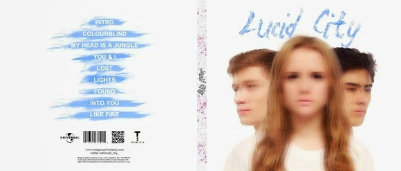
We created the logo on photoshop (shown above), using part of the banner to make a smaller image with the artist name over the top. This, again, is to create synergy with out other products.

The selection of products we decided to sell can be seen on the 'store' page:


Before putting photos of the band on the website, many of them needed editing to brighten them, clear up the skin of the members, and remove smudges of dirt or lines from the set. Here is an example of before (left) and after (right) we did this.


It is conventional of music artist websites to have a gallery page with pictures of the artist for fans to browse through. We decided to create two categories of pictures on our website: 'official' and 'behind the scenes'.
One branch of our 'gallery' page

The final part of constructing our website was adding a landing page. A landing page greets visitors to the website, usually with an advertisement, before leading on the actual website.


The focal point of our landing page is the album cover, used to promote it. The background of the page of the group of people covered in powder paint is used to create synergy with the rest of the website and or other products. We also added social media links and a music player to the landing page for increased interactivity with the audience.

The landing page can be viewed here.

The full website can be viewed here, and there is also a link at the top of my blog.

Creating the digipak

The first step in creating our album cover was picking the most suitable pictures of the artists for the front cover. The image we wanted to create was over-layed pictures of Georgie in the middle with the two DJs facing outwards, producing an effect similar to the cover of Robin Thicke's Blurred Lines EP cover (right).

Picking the best shots

For the image of Georgie this wasn't hard, as the lighting, framing and pose in each photo was of a good standard. We settled on this image of Georgie:


Choosing shots for the DJs was slightly harder as we had two angles to choose from:

Facing out at a 90 degree angle
Facing out at a 45 degree angle
After trying out both of these layered over the image of Georgie, we decided that the photos of the DJs facing out at a 45 degree angle looked best, as it showed more of their faces and overall looked more effective. It implies a larger role in the band and takes some of the focus away from Georgie, causing the image of the band to remain focussed on the fact that they are a trio.


Layering the images

To assemble the images we used photoshop to cut them our from their backgrounds, layer them on top of each other, and change the opacity so that the DJs could be seen through Georgie.

However, we realised that it didn't look as professional or effective as we ad hoped, so we decided that the image would need more editing to make it visually pleasing.


Our choice for further editing was to blur the images. This made them flow into each other better, and conformed to conventions of albums of this genre, by using heavy effects on the images. To do this, we layered two more copies of the image of each person on top of the existing image, and changed the opacity of each so that the images underneath could still be seen through them.


Title

As we had planned to use a picture of powder paint to fill our album title, we wanted a font that made it look as if it has been hand-written with the powder paint. We settled on the font shown below as it worked for this. We filled it with powder paint by creating a clipping mask for the text on photoshop and layering images of powder paint behind it.

Font for the title
After receiving audience feedback we decided to make blue the main colour of the text rather than pink, as we were told that the pink made it look too feminine, which would probably not appeal to a section of our target audience (16-24 year old males and dance genre fans) and does not represent the artist well, as it is two thirds male. The title before and after can be seen above.


Early versions of the front cover

The first version of our album cover looked like this:

Feeling that it looked a bit plain, we tried laying textures over the image to make the cover more interesting and eye-catching. Here are the results:


We used a laser-style texture to fit with the genre of dance music.

However, after asking our audience for feedback, we discovered that they preferred the original cover to the covers with textures. This is because it felt to them as if there was too much going on, and detracts from the blurred effect that they liked. Therefore, we decided to stick with the style of our original album cover.

Back cover

When researching conventions of album back covers, we took influence from the back cover of a Disclosure album, as they make music of a similar genre to our artist.

Disclosure album tracklist
We learned from this that the back cover is often plain and simple, and ties in with the theme or colour scheme of the album as a whole. Using this information, we created the back cover for our album. We kept the background plain just like the rest of the album, and used a particular brush to create paint-like smudges behind the track titles, creating a link between this and the powder paint used in the title on the front cover. The result is below.


Having realised that the brush we used also created grey boxes around the smudges, we increased the brightness and contrast of them to get rid f these. This also created a nicer blue, and one much more similar to the colour of our album title. We then also added a QR code to go alongside the barcode and record label logos, as these are industry conventions.

This is the finished version of the back cover of our album:


Final front cover

To add the final touches to our album cover, we changed the colour hue and contrast to make the image less pink. After making the banner on our website and the track titles on our album blue, we also decided to make the colour of the title completely blue to create synergy with these other elements. We also felt that this represents our artist better as the two males in the band, and the "not too girly" character of our female lead would be represented by the stereotypically masculine colour.


Inside panels

To keep with the minimal theme of our album, we chose to have pictures of our artists against plain white backgrounds across the inside panels of our digipak. Below are the images we picked. 


Our finished digipak looks like this:


Editing the music video

Using Adobe Premiere Pro, we began editing before we had completed all of our shoots. This made it difficult to edit the shots we had got coherently as much of what we had planned relied on improvised shots in a montage type sequence. However, we used our animatic to help us place shots temporarily into where we had planned.


As we began to place the shots where we had planned, we discovered that the pace of the white scene shots at the start meant that we had to cut out the forest scenes we had planned and so we cancelled the shoot for these. These were not the only shots that we found we had planned too much or too little time for, as we frequently changed the placing and timing of the shots we had when we got new footage or found a clip that went better with the music at a certain point.

We also realised early in the editing process that, following Carol Vernallis's theory of music videos, it would suit our video to cut the shots to the beat of the music. This was not the style we had used to begin with, and so it required us to go back through our edit and make the necessary changes.

After filling most of the timeline with footage, we found that there was a section of the video that was a bit slow and dull to watch. In attempt to make this bit more interesting, we tried out an inverted effect on performance shots of Georgie, fading between normal footage and footage with the colours inverted. 
However, this didn't create the effect as we had hoped for. 
We then tried overlaying two pieces of footage of Georgie's performance which we felt looked better, however after receiving feedback from our teacher who thought that it ruined an otherwise strong performance, we decided to cut it and try out a different effect. In another attempt to liven up this part of the video, we tried fading to black between shots, which looked like this:

However, we felt that this was a bit random and did not fit with the rest of the video.

The next thing we tried was layering footage of the DJs' performance over Georgie's performance. To do this we first had to cut the DJs out of the surroundings in their shots to place them over shots of Georgie without creating unwanted dark lines down the screen where the edge of the shots were. We started by trying to do this in Adobe After Effects, which was extremely time-consuming as we had to cut around the DJs frame by frame. We then realised that we could remove and unwanted sections of the frames using the 'screen' tool on Premiere Pro, and so we tried this as it made it a lot quicker. we then lowered the opacity of the overlayed shots on Premiere Pro to make the shots behind visible through the shots on top. This was the outcome after layering the footage:
We were happy with this effect as we felt it looked more professional than the others and did not look out of place as we used overlayed footage in other places in the video. Therefore, we decided to use this in the section of the video we had been trying to fill.

Next, we edited a rough cut of the ending of the video, which included a cross-dissolve from the balloon scene back to the white room for the final shot. We created the cross-dissolve to the ending shot in the white scene by linking a shot of Georgie throwing a white balloon towards the camera with a shot of Georgie in the white room with a 'cross-dissolve' transition. This made the shots fade together, creating a 'dissolve' effect. 

Before making more changes to the ending, we got feedback on our current edit from Chris, the media technician. 
Among other things, he suggested that we edit in more effects and make the editing more fast-paced to give the ending more impact, making it memorable for the viewer. We followed his advice and included effects throughout the video, some of which we placed in the end sequence. We also made the editing faster paced as he suggested, which we all agreed was an improvement. here is a video of this cut of the ending:


One of the other effects we created after receiving feedback from Chris was a blurred effect create by layering two pieces of footage, lowering the opacity and delaying one:

We also added in reverse shots. We did this by placing a shot on the timeline, copying it and changing the speed of the copy to 'reverse speed'. We then placed the two shots next to each other, creating an effect shown in the GIF below, where the paint seems to fly out of Eugene's hands and back into them again:

Our next step in the editing process was grading the shots. The overall effect we wanted to create with the grading was a bright, poppy feel for the video. We achieved this by adjusting the brightness, contrast, hue and saturation of the footage using 'ProcAmp' and the 'Three Way Colour Corrector' in Adobe Premiere Pro. Two ungraded and grade shots, and the tools we used for this are shown in the pictures below. The grading tools are on the left, with the ungraded shots in the top right and the graded shots in the bottom right:


The shots that needed the most changes made during grading were those form the footage we shot of the paint fight on the Canon HF G30. This is because this camera produced a lower quality of footage than the Canon 50D, which we had filmed the other half of our paint fight shots with. Therefore, we had to spend longer grading these shots to make them appear to be the same standard in terms of colour and saturation as the shots form the Canon 50D. After grading these shots, the colours of the paint and the trees looked much brighter and colourful, shown from the before (left) and after (right) images below:

After we had finished grading the video, we asked our teachers for some feedback. here is what she suggested:
We followed the advice to fade from black to the opening shot as this is more conventional of music videos, and it made it look tidier as the video opens with lyrics immediately at the start. We also went back to working on our grading of the paint fight shots after receiving this feedback as we were told it did not look as professional as it could.
Another thing our teacher suggested was to make all shots of the paint fight slow motion. However, as we had filmed all of this scene in 60fps, it was hard to slow them down to a speed that would look effective without making the footage look jumpy. Therefore, we felt that it was not worth making this change as they fitted fin with the video at their normal speed.
Another change we made at this stage was layering footage from Alice in Wonderland over the shots of Georgie after she takes a bite of the cupcake. This was a final touch that we had planned from the start as one of several references to Alice in Wonderland thorughout the video.
At this point we had a 'test edit':


We showed the test edit to our other media teacher, who suggested that we also use the overlayed Alice in Wonderland footage when we cut back to the white scene to show Georgie moving from the balloon scene to the paint fight in the forest. We tried this and agreed that it looked better and made the narrative of the video slightly clearer.

After making this change, we had our final edit of the music video. This is available to view at the top of my blog.

Friday 5 December 2014

Final shoot 25/11/14

For our final shoot we were in the studio. Due to having had a lot of experience with the lighting equipment at this point, we set up quickly and were ready in time for the arrival of our actors.


One of our close-up shots from this shoot
We had planned pick-ups for the beginning of the shot as we had realised during editing that we needed more close-up shots for the balloon scene. As our three main actors were not available at the time we had allocated for getting close-ups from the balloon scene, we used several extras for these. Fortunately, they were eager to dedicate time to this, which was a great help to us as it contributed to the variation of shots in our video, which will make it more interesting. These shots didn't take too long, allowing us plenty of time to set up for our next shot: an additional white scene shot of Georgie for the final shot.


This did not take long at all, as we had decided in advance that we wanted a shot of her 'waking up' in the white room at the end of her trip. We got a few takes of this and then moved on to the next set-up.
The final shot of our video
The next shots we got were close-ups of each band member for the album cover. We dressed them all in white t-shirts so that the photos will blend together better when layered over the top of each other, which is an effect we plan to use for our front cover artwork. These are three possible shots we can use for this purpose:

The final shots we planned for this shoot were promotional shots that were completely separate from our video in terms of costume and setting. We understood that it is important to create an identity for our artist that is not only limited to their portrayal in the video, and therefore we dressed them in new costumes and photographed them against a plain backdrop. Here are some of the best shots we got:

I feel that this shoot was a success as we had time to get all the shots we needed and we were 
all pleased with the resulting footage and photos.

Location shoots 20/11/14 and 24/11/14

We shot the paint fight scene over two different shoots.

20/11/14


The first shoot was on November 20th over a lunchtime (12:30-1:30). This meant we were very limited with time, and so we made sure that everyone had their make-up done and costumes on prior to this. 

Georgie was unavailable for this shoot, so we tried to get as many close-ups and shits of the DJs as possible, to make it less obvious that she wasn't there in the wide shots. We decided to plan wide shots for the next shoot, so Georgie would be in them.

As we were short on extras, Mari, Ellie and I took part in this scene, throwing powder paint at each other in the background to make the scene seem more lively.


We shot using the Canon 5D and the GoPro. To get the GoPro shots we wanted, I ran through the paint fight and had people throw powder paint at the camera lens. We filmed in 50 fps on the GoPro so that we can slow them down in editing and still have a reasonably good quality of footage. We were really happy with the footage from the 5D as it captured the colours of the paint and and trees in the background really well. We also felt that we had achieved a good range of usable shots on this shoot.

We also had time to take some 'behind the scenes' shots of the DJs and extras for our website:
Eugene and Gavin
Edited photo of extras

The only problem with this shoot was the time limit, as we overran and had to rush to get cleaned up and ready for lessons before the end of our lunch period. Due to the improvised nature of the shots we wanted, we hadn't been able to plan the shoot precisely and so had only guessed roughly how long it would take. We realised that for the next shoot, we will have to think more carefully about what shots we want and plan how long each one will take in order to finish on time.


24/11/14

For the second shoot, Georgie was available. However, we still only had a lunchtime to film everything so Ellie and I made our way over to the rec early to set everything up.

When Georgie and the boys arrived, we began filming straight away. Having learned from the previous shoot we planned ahead which shots we wanted and ticked them off the list as we got them. Mari, Ellie and I acted as extras again.

Unfortunately, the Canon 5D had been booked by another group for this time slot and so we had to use a poorer quality camera. This meant that our shots from this shoot will not match the look of the shots from the last one, but this can be fixed in grading.

We got all the shots we needed and were pleased with the footage. We managed our time better on this shoot, and were able to get changed and remove most traces of powder paint before lessons began again.

Here is a compilation of some of the footage from both shoots: