Welcome to my A2 media coursework blog. My name is Maisie MacGregor (candidate number 0506), and I will be working in group 4 with Molly Sullivan (candidate number 0816), Ellie Brackpool (candidate number 0100), and Mari Leach (candidate number 0440).

To the right of my blog are labels for my A2 Preliminary task, A2 Research and Planning, A2 Construction and A2 Evaluation, and an archive of each individual post. There is also a live link to the Latymer Media Music Video Blog.

Click here to access Group 4's faceboook page.

Thank you for taking the time to look at my blog.

Music Video

Our Music Video

Digipak Front and Back Cover

Digipak Front and Back Cover
Our digipak front and back cover

Digipak Inside Cover

Digipak Inside Cover
Our digipak inside cover

Click on the image to open our website in a new tab

Click on the image to open our website in a new tab

Friday, 31 October 2014

Lighting and Set Design

Our music video will be structured around four set-ups, each with different lighting and props. These are: band performance, the white set-up, the balloon scene and the paint fight.

Performance scene
Georgie will be at the front in the centre with the two DJs slightly behind on either side.

Lights
The video below shows us experimenting with different positioning and colours of the lights while programming them for this scene.


We decided on having two blue lights on each of the DJs and two pink lights on Georgie with no other lighting around them. This is so that the lights are not too bright, to keep a contrast between this scene and the bright colours of the other scenes to make sure it is obvious performance is separate to the narrative. However, we will be using the white backdrop.

Props
  • Microphone & stand
  • A sound board for one DJ
  • A keyboard for the other DJ
  • Signs in the background (inspired by the signs in the forest in the 1951 Disney Alice in Wonderland film)
Scene from AIW film
Examples of props similar to what we want to make
  • Giant playing cards hanging from the ceiling (also in keeping with the AIW theme)
Example of hanging playing card props

White scene
The set will be empty and white apart from a cupcake on a table in the centre. Georgie walks in the eats the cupcake.

Lights
Very bright, white lights (using all the lights) and a spotlight on the cupcake.
Setting up the spotlight for this set-up
Props
  • Table
  • Cupcake

Balloon scene
Balloons all over the floor, Georgie and the two DJs with 5 or 6 extras dancing, messing around with the balloons.

Lights
Mainly white (dimmer than for the white scene) with pale blue lights on the backdrop. 

Props
  • Purple, blue and marbled balloons all over the floor
  • A mushroom prop made out of balloons (wire and papier mache base with balloons attached) 
Examples of what the balloon mushroom will look like
Before making the prop for the real we, thing decided to test it out to see if the structure would hold up the balloons and if it would actually look convincing. After a successful trial, we have decided to go ahead and make a bigger, correctly coloured balloon mushroom for the real thing.
Ellie with our trial mushroom


Forest scene
A clearing in the forest with Georgie, the DJs and 8 or 9 extras having a paint fight.

Images which provided inspiration for this


Lights
We won't be able to have proper lights so we will be relying on natural lighting.

Props
  • Powder paint 

Costume, hair & make-up

White scenes

Georgie: casual clothes, make up simple but bold enough to stand out on camera (e.g. mascara, thick eyeliner, red lips)


Forest

Georgie: same as white scenes as they join up


Performance

Georgie: smoky make-up, sparkly jumpsuit, black high heels


DJs: short sleeved shirts open over white t-shirts, jeans


Balloons

Georgie: Purple disco pants, tie-dye t-shirt, trainers. Bright coloured eyeshadow (pink and blue to match the colour scheme of the balloons) 

Gavin: bright patterned shirt, jeans, trainers.

Eugene: bright patterned shirt, jeans, trainers.

Extras: one crazy/funky/patterned item of clothing each with everything else dark/plain (e.g. black or dark jeans/shorts/skirt)


Paint fight

Georgie: white top, black bottoms. Standard make up (foundation, mascara, black eyeliner) as her face will end up covered in paint anyway.


Gavin: white t shirt, dark jeans

Eugene: white t shirt, dark jeans

Extras: white top and dark bottoms

Casting

Female lead 

Georgie Thoupos 


We chose Georgie because, as she has acted and lip-synced in previous media projects, she is a confident and experienced performer. Georgie took media at AS level so she understands the commitment needed to a project like this. For these reasons, we feel that she meets all the criteria needed for the role.


DJs 

Gavin Fraser 

Gavin has had experience performing in media projects before, including a music video, and so he is confident in front of a camera. He is also a media student working on his own music video, so we know that he will understand the pressures of this and will be reliable and hard-working.


Eugene Leach 

Eugene has no previous experience in performing. However, he is confident and is friends with Gavin, our other DJ, so they should have chemistry when on screen together. As he is the brother of a member of our group, we are sure that he will be reliable, cooperative and committed to the project.

Wednesday, 22 October 2014

Publicity Shots

For our publicity shots, we want a mix of serious and fun shots to match the serious performance and more fun narrative sides of our video. We also plan to take promo shots during the filming of our video, using the set-ups and costumes form each scene, to create synergy between the two. We think that the using the balloons as props, particularly their static charges, and the fun nature of the powder paint fight will create the playful image we are going for. However, shots from the performance set-up and set-ups specifically for publicity shots will help create a balance between fun and serious, ensuring that they are taken seriously as an artist.

We plan to get individual shots of Georgie, and of just the DJs without Georgie. This is to give us a wider range of composition and framing, which will make the selection of photos on our website more interesting.

When researching influences for the shots, we found this publicity image of Ellie Goulding. We really liked the over-layed images and are hoping to do something similar with our promo shots of Georgie.
Ellie Goulding

As we are going for a mixture of fun and serious shots, we took inspiration from Disclosure's publicity shots for shots of the DJs. They often mess around but also pose for serious photos, which is what we are hoping to achieve with or DJs.
Disclosure

For shots of all three members of our artist, Paramore were a main influence, as they consist of a female lead and two males. The style of their promo shot below inspired us in two ways:

  • The two male artists dressed in black while the female stands out - we want Georgie, as the lead, to be the main focus of the collective.
  • The coloured light on them - similar to the powder paint shots we want to get.

Paramore

Our main aim with the publicity shots is to get a wide range of set-ups and costumes. Therefore, as well as taking photos in our video set-ups, we are also going to schedule several other shoots with various different costumes and lighting.

Website design & influences

When brainstorming ideas for our website, we decided on several main features we would like:
  • Blog-style: the visitor is able to scroll through pictures, sound clips and links to social media posts 
  • A banner across the top 
  • The links list across the top
  • Colour scheme to match the powder paint in our music video and our album cover (blue, pink, purple)

The inspiration for this came from the websites of existing artists, including:

Disclosure 
The Disclosure website has the artist name and links along the top of the page, and three columns of posts including photos, videos and sound clips.

The 1975
The 1975 website also has a blog-style format, allowing the user to scroll through pictures and videos of the band.

Beyoncé
The Beyoncé website has a banner across the top and an endless scroll format, filled with pictures and links.


After deciding these features, we came up with a flatplan:

Flatplan for our website
This is a very basic outline of our plans for the website. 
The banner across the top will contain our artist logo, into which we want to incorporate powder paint in the colours of our chosen scheme. 
The main page will be much more lively and engaging, including images, videos, links to social media pages for the artist, sound clips and adverts for competitions. 
In addition to this, we will use a font for the website more suited to the image of our artist, and a blue, pink and purple colour scheme rather than black and white. 
The menu of links across the top will include all essential pages so as not to crowd it - options such as 'about the artist' will have drop-down menus to take the user from the home page to a certain branch of the page.

Album cover design & influences

Before we began to design our own album artwork, we researched the conventions of existing album covers. We found that they tended to have one striking image or focal point, often (but not always) the title of the album and the artist name, a theme throughout every panel of the album to create branding, and industry necessities such as the barcode and copyright information.

We decided on a few main features we wanted for our album artwork, such as sticking to the colour scheme of our video, involving powder paint in some way, and having a picture of the artist on the cover.

Next, we began to think about the design of our album, taking artistic influence from a number of existing album covers. 

Dance music albums
Example - Live Life Living
Caribou - Our Love
Flying Lotus - You're Dead
SBTRKT - Wonder Where We Land
These albums of the same genre as our track are in the charts at the moment. They are colourful and vibrant, which seems to be a recurring theme with dance music albums. We took this in to consideration when thinking about the colour scheme of our album artwork, as we want to make sure we appeal to our target audience.
.
Other inspiring albums
MGMT - Oracular Spectacular
San Cisco - San Cisco
Vampire Weekend - Contra
We were also inspired by the colours and colour gradients of the albums above. We have decided to pick similar colours of powder paint - pink, blue and purple - for our paint fight scene to create an image of branding for our artist. We particularly like the composition of the MGMT album cover with the artists standing side by side and the artist name over the top in white text. It is also similar to the Paramore album cover (below) which equally inspired us.

Paramore 

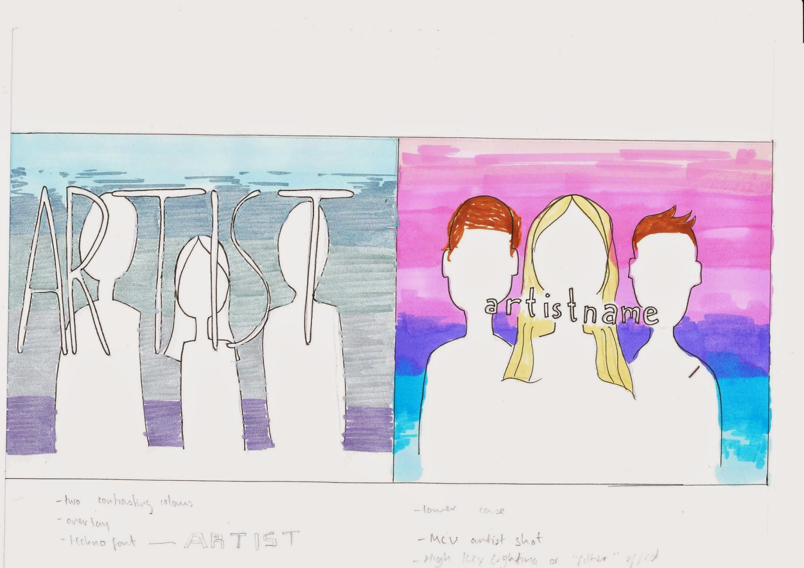
These are our first rough plans for the design of the front and back cover of our album artwork:

Front cover: two possible variations
Both these variations include a picture of the artist and the name of the artist, along with a colour gradient as the background. We are still unsure about what we want the exact composition of the artwork to be, and we intend to try a few different options when we begin creating the digipack. 

Back cover

The image of a group of friends in a forest on the back is the same place the powder paint fight will take place and is meant to create synergy between our video and the album, the same way the powder paint colour scheme will. 

For the inside cover, we plan to have a photo of our female artist blowing powder paint across the two panels, similar to the image to the right. In our shot, the paint will be the same colours as our colour scheme with a white background to emphasise the vibrancy of the colours.
This colour scheme is something that we plan to use across our video, digipak, and website to create a strong sense of branding for our artist's debut album, which is a technique used throughout the music industry.


Production meeting: deciding specifics of set-ups

In today's production meeting we first decided on exactly how many different set-ups we would have and what the main idea for each would be. The basic scenes we needed were narrative and performance. We have decided to split our narrative into three scenes (empty white room to introduce the narrative, balloon party, and paint fight in the forest), and to split our performance into two set-ups (normal and neon). 
After deciding this, we began to discuss some specific props, costume, composition and shots we wanted for each set-up.
Here are the notes from this meeting:


Make-up guidance (17/10/14)

We met with Olivia (an ex-Latymer pupil who specialises in make-up) to discuss the images of our artists and how to create these. One important tip she gave us was to use dark purple or green make-up on Georgie for our neon-look scenes. This is so that when we invert the colours the make-up will look bright orange/yellow and her skin will look black/dark, which will have the same affect as using neon paints.

The rest of our notes from the meeting:


These notes mainly consist of basic make-up tips to make sure the actors don't look washed out/shiny/a strange colour on camera. As no one in our group is particularly good at doing make-up, we found this meeting with Olivia incredibly beneficial to our project, as we now have a better idea of how to create the looks we have imagined for our artists.

Friday, 17 October 2014

Props List

The props we have decided to use so far are:
  • Piñata
  • Powder paint
  • Balloons for floor
  • Balloons for mushroom
  • Sign posts
  • Neon paint
  • Neon make up
  • Giant playing cards
  • Styrofoam balls
  • Papier mache mushroom
Some of these can be made or borrowed, but some of them will need to be bought.

We have started to search for websites that sell the props we need online, and so far have found some balloons and a piñata that will look right for our video.

We have decided to buy the powder pant in large quantities and fewer colours as we need a lot of it for our shoot and promo shots, and so are purchasing it from the ELC website. This also means that it is safe (in case it gets in someone's eyes/mouth/etc) as they supply thier products for young children.

Powder paint supplier


Production meeting 17/10/14

In our prouction meeting today we talked through the technicalities of shooting our music video with Chris, the media technician. He gave us advice for our ideas that would need special technology:

  • Slow motion shots: he recommended that we film in 50fps on the GoPro or the Canon 5D. however, as we have planned the slo-mo shots for the paint fight, we thought it best to use the GoPro as it has a protective case, whereas the 5D could get ruined b the paint.
  • Neon performance: the media department only has one black light which would not be strong enough to make this possible. He suggested we test it anyway, or film in normal lighting with dark make-up and then invert the colours in editing for the same effect.

We are able to plan in more detail after this meeting as we now have an idea of what is and isn't possible to achieve.

Request for permission to use the track

In order to obtain permission to use our chosen track, we had to request it from the record company which owns the rights to the song. After searching online for the right person to contact, I sent an email on behalf of my group to the record label which owns the MK remix of 'My Head is a Jungle':


They emailed us back, granting us permission to use the track.


However, they also sent us a document with a few conditions we have to stick to if we are using the track:


The gist of these conditions is that we must acquire the song by legal download or purchase, and the final project must not be broadcast publicly or commercially. As we plan to upload the video to YouTube, we saw this as a huge problem. However, there are other websites such as Vimeo were we can upload the video and keep it private, and so therefore, our request for permission was successful.

Thursday, 16 October 2014

Production meeting 16/10/14

In our production meeting today we tested using overlays of pieces of footage. 
Our initial idea was to project footage from Disney's 1951 Alice in Wonderland over our artist while we filmed it, but after realising that the projector would not be strong enough to be picked up by the camera, we decided to use overlays instead.

Our idea is to have footage from Disney's 1951 Alice in Wonderland over the top of our female artist during some parts of the narrative. To test this, the group filmed me acting as we want Georgie to in the video, and edited it with the Alice in Wonderland footage over the top by changing the opacity.
We were really pleased with the result (which is shown below) and so we will definitely be using this technique for the real video.


Animatic


We made the animatic to help us to plan the specifics of our different set-ups, and to plan the sequence and timings of the shots. The different colours for different scenes allowed us to vaguely visualise what the video will look like and what order the shots should go in.

Scene key
Green - forest scenes
Pink - performance
White - white backdrop scenes
Blue - balloons scenes
Black - neon scenes

After creating the animatic, it has made it much clearer in my mind what we want the final product to look like and how the different scenes will fit together. This has also made it easier for us to make a shot list as we have a reference for what shots we want to get.

Storyboard

As part of the planning process for the video, we made a storyboard:


  • By colour-coding the different set-ups (yellow for forest scenes; pink for performance scenes; orange for white scenes; blue for balloon scenes; blue&highlighter for neon scenes) we were able to visualise the sequence more clearly, which helped us to decide how to order the different scenes.
  • We weren't able to plan every single shot for the storyboard as a lot of our shots will depend on what we film on the day, as some of it will be improvised (e.g. paint fight, balloons). 
  • Making a storyboard was important as we were able to make sure that the shots we did plan will fit together well.
  • We all contributed to the storyboard. The artists did most of the drawing but we all had a say in what each shot should entail, which shots went where and how long they should last.

Tuesday, 14 October 2014

Lyrics analysis

We drew some ideas from the lyrics of our chosen song to help us plan the video:

  • The chorus ("My head is a jungle...") inspired most of our ideas, as the character in the narrative is imagining all the crazy things happening around her.
  • The part of the song where the music suddenly slows down influenced us to film slow motion shots for this bit.
  • We felt that the performance side had to come in at a suitable time and not too far in to the song, so we decided this should happen at the start of the first verse, after the intro.
We have decided to create what Goodwin would describe as an amplified relationship between the lyrics and the visuals, by taking the serious meaning of the lyrics and creating a fun and upbeat interpretation of them. The performance aspect will contrast to this, taking the lyrics much more seriously and illustrating the deeper feelings being sung about. Put together, these will help to create a sense of escapism.


Wednesday, 8 October 2014

Production meeting week 3

We started our first meeting this week by making a to-do list of all the things we needed to discuss in that meeting. We then went on to discuss and plan the narrative sequence in our video, and the specifics of the different set-ups.
To-do list
As we plan to use a lot of props and creative techniques, we decided we need to test them so that we get it right and it looks good for the actual shoot, so we made a list that we can refer to as we continue to plan and develop our ideas.
List of things that need testing
The main purpose of our meeting this week have been to discuss and confirm the ideas and concept for our video. We have decided on definitely having Alice in Wonderland influences, a powder paint fight, slow motion shots, balloons, projections of archived footage and hopefully shots using neon paints and UV light (all shown in the lists above).

Production meetings week 2

In our production meetings this week, we made final decisions on the four main aspects of our project: 

  • Audience 
  • Record label 
  • Track
  • Artist

The details of these decisions are in the separate posts below.

Monday, 6 October 2014

First production meeting

In our first meeting we shared and discussed all our individual research and ideas, and started to search for suitable tracks to use. We all agreed that we wanted an upbeat, dancey song.
Originally, we wanted the video to follow a group of friends around London, but after realising this wouldn't be easy to light, or to film in the cold in November, we started to brainstorm ideas that could be filmed in the studio. To help with this, we watched videos for existing dance songs.

A few ideas we came up with after this were:
  • Lots of people dancing
  • Use of effects such as looping footage, flashing images, etc.
  • Powder paint fights
  • Still incorporating a group of friends in some way
  • Fun performance, not taken too seriously
We ended the meeting agreeing to do our own research and bring ideas to share at the next meeting.

Thursday, 2 October 2014

Artist

Our artist consists of a female lead and two male DJs. We chose this as having a mixed group challenges traditional conventions, which means there will be a gap in the market for it. However, the two DJs being male and the singer being female conforms to conventions, so the group will still appeal to audiences.

The image we are trying to create for the female is an aspirational figure who is not overly sexualised. We feel that this type of artist will be attractive to our target audience, which was a main criteria in making our decision. Our influences when deciding this included Aluna Francis (of AlunaGeorge), Katy B and Kiesza
Left to right: Aluna Francis, Katy B, Kiesza
The image we decided on for our male DJs is friendly, cool and laid back, which challenges the stereotypical egotism that many male artists present. However, we don't want to differ too much from conventions to maintain a connection with our target audience, and so we have based our DJs on popular DJs such as Disclosure, Flume and Wilkinson.
From left to right: Flume, Wilkinson, Disclosure

Track

We have chosen the MK remix of 'My Head is a Jungle' originally by Wankelmut & Emma Louise 


The original song is 'Jungle' by Emma Louise, which was then remixed by Wankelmut and renamed 'My Head is a Jungle', and this version was then remixed by MK.

We have decided to keep the name of the song the same as it reflects the theme of the video.

This song would be suitable for our music video as the MK remix is fairly unknown, and the genre of the song suits our ideas.

We plan to create what Goodwin would describe as illustrative visuals based on the music, by keeping the editing fat paced to go with the fast tempo of the song and cutting to the beat.

Record Label

Our label will be called Technicity Records: a smaller, dance genre-specific label owned by Universal. We felt that the word 'technicity' has an electronic feel which will represent the dance genre image we are trying to create.


We modelled our record label on the label that owns the original version of 'My Head is a Jungle' - the smaller, genre-specific label Positiva which is owned by EMI, a larger label. Positiva is one of the biggest labels for dance music in the UK, representing many popular artists, including Avicii, Martin Garrix and David Guetta.
By having our own label owned by a larger company, it will allow us to stay dance-specific without having to branch out into other genres to make a profit. Positiva is an example of this. 


Audience

Primary audience: 16-24 year old females. Our artist includes a strong, non-sexualised female lead who can be seen as a role model for this group.
Primary audience


Audience profile:

  • teenage girl
  • not particularly girly
  • likes going out, dancing, partying


Secondary audience: 16-24 year old males. Dance music is particularly popular with both females and males in this age group, and our artist includes two male DJs which could appeal to this audience.

Tertiary audience: fans of the dance music genre, as the style of the music and video should appeal to them. We will also be using festival style imagery in costumes and settings throughout the video, which many dance genre fans will be able to connect with, as dance music festivals are very popular.

Wednesday, 1 October 2014

Steal-O-Matic


The steal-o-matic is a collection of media texts such as music videos, YouTube videos, gifs, TV shows and films that have influenced and inspired our own music video idea. 

How the videos shown in our steal-o-matic have influenced us:
  • Alice in Wonderland: 
    • narrative reference to eating cookies - our artist will find and eat a cupcake
    • projections of archived footage in the '90s Baby' video - we want to project Alice in Wonderland footage over our artist performing
    • scenery - mushrooms, forests
  • Powder paint fight: we want our characters to have a fight with powder paint. Originally we wanted to film this in the studio, but as it's too messy we are considering filming this part in Epping forest. Which leads on to...
  • Forest party: all our references to forest parties are set at night, but we plan to film during the day as it is safer and easier to light.
  • Dancing: we have chosen a dance track, so dancing will be an important element. Our aim is to have fun, bouncy dancing (like the style in the 'Fishing' video) rather than serious or choreographed dancing.
  • Female artist: attractive but not sexualised
  • Male DJs
  • Performance:
    • close up of lips (neon, inverted colours)
    • projections over artist
    • Janelle Monae (stuff happening around the artist)
  • Editing: 
    • reverse shots
    • double exposure/overlaying of videos
    • colour changes (e.g. thermal imaging in 'Route 94' video)
  • Pinata: we want our artists to be hitting a pinata in one of our scenes
  • Mushroom forest/balloons: 
    • mushroom made of balloons 
    • balloon fight in one scene
    • glitter inside balloons
The main ideas we were trying to convey with our steal-o-matic were the shooting and editing techniques we plan to use, but also the visual impression we are going to attempt to create. The constant use of vibrant colours and the fun, upbeat feel of the clips is something we are hoping to recreate with our video. We feel that this will give the video a surreality which will amplify the lyrics "my head is a jungle".