Digipak Front and Back Cover
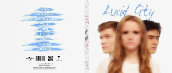
Our digipak front and back cover
Digipak Inside Cover
Our digipak inside cover
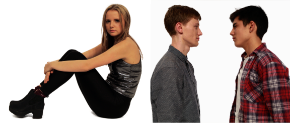
Click on the image to open our website in a new tab
Click on the image to open our website in a new tab

Sunday 25 January 2015
Monday 5 January 2015
1) In what ways does your media product use, develop or challenge forms and conventions of real media products?
 |
| Lucid City |
Music Video
Andrew Goodwin suggests in Dancing in the Distraction Factory that videos of the same genre will often contain similar characteristics. When researching dance music videos we found some common features that they shared. We followed some of these conventions to ensure that the genre of the video could be recognised and attractive to fans of this genre. We also challenged some conventions when constructing our music video, as we wanted to create something original and unique to our artist.
While our music video demonstrates some of these genre characteristics, we left others out. Those that we did not include are large crowds, strobe lighting, and the setting of a club or festival. Planning to film large crowds was impractical as the space allocated to us to film and the number of actors available to us would not have allowed for it. Similarly, the equipment provided by the school does not include strobe lights and therefore, this was also impossible. Our reason for not setting our video at a club or festival was because we wanted to create a fantasy setting rather than basing it on reality. We did, however, include festival-like imagery in our video to appeal to our frequent festival-going target group of 16-24 year olds, and also fans of the dance genre as many festivals are dance music-orientated, so they may enjoy this reference.
Despite challenging these conventions, we conformed to others shown in the Padlet above, such as:
Dancing
We conformed to this as it is a prominent convention of dance music videos, used in videos such as Route 94's 'My Love', and so we felt it was important to include it. Dancing is a main element of the balloon scene: all the extras in the background are dancing, with the artists dancing in the foreground.
Editing style
Our style of editing was very fast-paced and cut to the beat, which is a style found in many dance music videos including Redlight's '9TS'. We tried to make sure every shot changed to the beat of the music, but there are some sections where this is more obvious such as when paint hits the camera or a person on the beat. Carol Vernallis suggests that this is conventional of music videos, and it can be seen in some videos of the dance genre, as it strengthens the link between the visuals and the fast-paced, beat-heavy music. This video shows where we have cut the shots to the beat, edited the paint fight scenes so that paint hits a person on the beat, or used fast paced editing.
Editing effects
We decided to use effects in our video as this is very typical in videos of the dance genre, such as ZHU's 'faded'. The effects we used include layering clips with footage from Alice in Wonderland, layering the DJs over Naomi performing, reversing shots, repeating shots, and layering and delaying shots to create a blurred effect.


Camera Movement
From our research, it seems this is not often used in videos of the genre. However, to increase the variation of our shot types, we used camera movement for some shots of performance and paint scenes (shown below).
 |
| Moving shot in the performance scene |
 |
| Camera movement in the paint fight |
Concept, Narrative or Performance?
Narrative
The narrative of our video follows Todorov's narrative theory as it begins with equilibrium, meets disruption in the middle, and ends with a new equilibrium. This is an outline of the video's narrative:

 |
| Cross-cutting between scenes |
Performance
For our performance scene set-up, we took inspiration from other dance artists such as Disclosure who used a symmetrical set-up in the video for 'F For You'. We followed this convention, placing the DJ desks either side of Naomi.
 |
| MCUs |
 |
| CUs |
 |
| Click to enlarge |
The diagram to the left shows where our inspiration for the style of these shots came from.
Illustrative, Amplified, or Contradictory?
Andrew Goodwin suggests another three categories that music videos can be split in to when referring to the relationship between the music/lyrics and the visuals: illustrative, amplified, or contradictory.For example, videos such as Miley Cyrus's 'Wrecking Ball' illustrate the lyrics of the song:
 |
| Miley Cyrus - Wrecking Ball |
 |
| Kanye West - Homecoming |
Alt-J's video for 'Tessellate' uses disjuncture between the lyrics and the visuals. The lyrics "bite chunks out of me, you're a shark and I'm swimming" have no connection to the visuals on screen at the time they are sung.
 |
| alt-J - Tessellate |
 I think our music video mostly amplifies the meaning of the song, as we took the main lyric of the chorus - "my head is a jungle" - and portrayed a character exploring a fantasy world in her head, rather than a literal jungle. As the protagonist's adventure shows likeness to that of the fantasy world in 'Alice in Wonderland', it portrays it as an escapist experience, further amplifying the lyrics of the chorus. Escapism is a common reason for consuming media texts as many people can relate to the need for it, making it an attractive feature which therefore increases our chances of appealing to more audience groups than our main target groups of 16-24 year olds and fans of the genre.
As well as amplifying the lyrics, the visuals also illustrate the music, for example by our use of slow motion shots at the slower parts of the song and faster-paced cutting when it speeds up:
 |
| Slow motion shots for slower part |
 |
| Fast cutting at build up to the chorus |
However, there are also some points in the video where the visual contradict the lyrics, causing disjuncture between them:
 |
| The lyrics "in a dark room" are contrasted by the setting in a bright white room |
 |
| The lyrics "see the pain in your eyes...I've been aching" are contradicted by the fun party world that the protagonist is imagining |
Representation of our female artist
This Prezi explains what image we were aiming to create for our female lead and which artists inspired this image.
Intertextuality
Intertextual references are often used in music videos, using the references to popular culture to appeal to and connect with the audience. Here are some examples of this:
We used intertextual references to Alice in Wonderland in our video, shown through our choices for scenery and the narrative of our video. As many people in our target audience group of 16-24 year olds watched this film as children, these references may create nostalgia for them, increasing the appeal of our music video. The main idea of the video is that the character takes a bite out of a cupcake and ends up going on a crazy imaginary journey similar to the adventure that Alice has in 'Alice in Wonderland'. The references which show this are included in the video below.
Debut albums are often self-titled, and so we decided that our artist's debut album would have the same name as them: Lucid City.
 |
| Examples of eponymous albums |
...
The album covers in the slideshow above show the dance genre characteristics of album covers, including having a focal image of the artist and the artist name. We followed both of these conventions with our album cover. We noticed that images on the front of dance album covers often have special effects, such as the kaleidoscope effect used on the cover of 'Body Music' by AlunaGeorge. We also used effects on the image on the front cover, layering the same images over the top of each other to create a blurred effect.
However, as shown above, dance albums tend to be busy or colourful, and we challenged this with a white background and more minimal style of design. Our reason for doing this was due to the feedback from our primary and secondary target audience groups, who preferred the minimal, plain design to some patterned ones we had tried out.
 |
| Our album front cover |
 |
| A comparison between our album back cover and MGMT's 'Oracular Spectacular' back cover. |
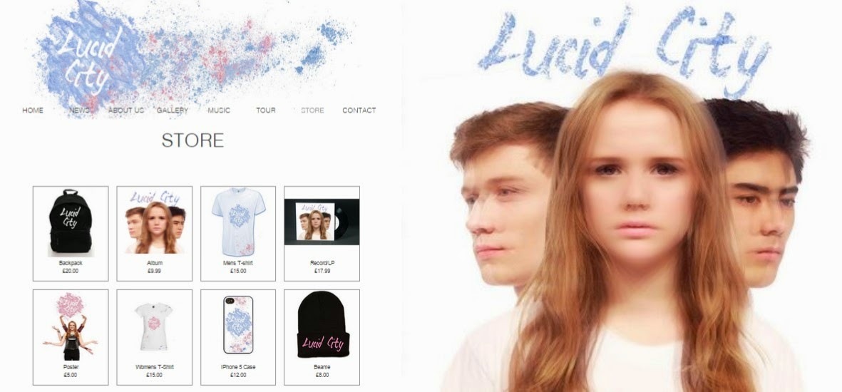
Website
There are several conventions of websites for artists of the dance genre, which we strived to follow in order to make the website and therefore the the artist recognisable by its genre. This SlideShare presentation explains these conventions and how we conformed to or challenged them. View it in full screen to make the text and visuals clearer.
Throughout the music video, album cover and website for Lucid City we took influence from real dance music artists and followed the same conventions they use. However, we also broke some conventions and introduced our own features to make our artist identity more personal to them. In conclusion, we have created an original dance artist that is still a recognisable product of its genre.
2) How effective is the combination of your main product and ancillary texts?
The purpose of producing our three texts was to create a marketing campaign that would successfully reach our target audience. The music video is designed to promote the album that the song comes from, and the artist's website is the hub of this campaign, as it is a platform to watch the video on, buy the album from, and also contains other types of advertisement such as products for sale and opportunities for interaction which will increase sales. We produced all three of these products, incorporating similar elements in to each one to create synergy between them. This added to the overall artist image, which is used to create a sense of branding. For this to work effectively, we first needed to decide what image we wanted to create to promote the album. We aimed to create this image using our music video and debut album cover, as according to Richard Dyer's star theory this is the most common way an artist establishes their image.
The word cloud below contains some words describing the image we strived to create:
From looking at examples of album releases of artists we had based Lucid City on, we knew that in order for our products to be successful, one of the most important things we had to do was create synergy between them, to produce a strong sense of branding that would become recognisable to the audience. We took a lot of influence from Disclosure's campaign for the release of their album 'Settle'.
Click and drag the mindmap to view the branches: Mind Map created by d08mamac with ExamTime
Iconography: Powder paint
The main iconography we used in our video was powder paint, which we incorporated into all three products. This is used to create synergy across the three texts to increase the effectiveness of the campaign. The picture below shows all the ways we used powder paint.

Typography
Influenced by Disclosure, we used the same font on our album back cover and the website (right). We also used the same font for the title on our album cover, the banner on our website and the logo on our merchandise (below). Like our use of powder paint, this is used to create synergy and increase the strength of our branding.
Blurred effect


Publicity shots
We created synergy between our music video and publicity shots by taking photos of the artist in the same costumes and sets as in the music video, as well as having other costumes and set-ups that were unrelated. This creates a link between the music video and our website, where the pictures are posted. It also adds to the fun identity of the artist as having these photos as publicity shots implies that their playful personalities aren't just an act for the narrative of the video, but their real personality.
As well as the texts working together to create and image for the artist, the combination of the three products makes up a strategic marketing campaign. The websites acts as a hub for this campaign, as it converges all the products into one platform where the video can be viewed and the music can be bought.
As the point of this campaign is to sell Lucid City's, we included lots of opportunities on the website to purchase the album. These included both physical copies of the album for sale and digital download options through either iTunes or Amazon to maximise sale possibilities.
Disclosure also included an advertisement for their music on their landing page, as well as elsewhere on their website, optimising their possibilities of making sales:

As well as encouraging visitors to buy the album, we included other purchasing opportunities. This is because we know from Richard Dyer's star theory that the audience will often respond to elements of the artist's persona by spending money on things such as concert tickets and merchandise. We included the opportunity to buy both of these on our website.
The social media pages also gave us a greater chance of reaching audiences we weren't specifically targeting as the followers are able to 'retweet' or 'share' posts with their followers, who can then share the posts with their followers and so on. This means that a person from any demographic could end up seeing the post, and if it appeals to them they can click onto the artist's page and then onto the website, where they can purchase the music.
Overall, I think we managed to create a strong sense of branding across our main product and ancillary texts, using synergistic links between to maintain a consistent image for our artist. In addition to this, we chose our marketing strategies to specifically target the three audiences we were aiming to appeal to, and in combination with the synergy of our products this allowed us to create an effective marketing campaign.
The word cloud below contains some words describing the image we strived to create:
As Dyer states, an artist's image is not restricted to their music. He argues that this is because a 'pop star' and a pop performer are not the same thing, as a 'star' is an artificial persona created by the industry to sell a product. Although Lucid City is not a pop artist, the same principle still applies as we have made choices to create a particular image for the artist to sell their music to particular audiences.
Click and drag the mindmap to view the branches: Mind Map created by d08mamac with ExamTime
Dyer's theory tells us that many audiences find pleasure in consuming products that follow a formula of codes and conventions to create something that is of a recognisable genre. We took this into account when producing our music video album cover and website by following conventions of the dance genre. However Dyer also says that it is important to provide something fresh for the market, and so while we followed genre conventions, we also created a unique image for our artist. We did this by using the following features:
Colour scheme
Disclosure use the same colour scheme across their album cover, website and videos, which is what we have done by repeating the same colour scheme of blue, pink and white across all three artefacts. We picked this colour scheme as we felt that the stereotypically feminine pink would help us appeal to our primary target audience of 16-24 year olds females,while the stereotypically masculine blue would maintain the appeal of our artist to our secondary target audience of 16-24 year old males.
The collage below contains examples of where we used this colour scheme, including our album cover, website banner, merchandise, and lighting for the performance scenes of our video (hover over the images to enlarge them or click to open in a new tab).
Iconography: Powder paint
The main iconography we used in our video was powder paint, which we incorporated into all three products. This is used to create synergy across the three texts to increase the effectiveness of the campaign. The picture below shows all the ways we used powder paint.
The repeated use of powder paint is similar to Disclosure's repeated use of drawing of faces over the artists. Our main reason for doing this was to create strong branding, but we also felt that the image of powder paint would help appeal to out primary and secondary audiences of 16-24 year olds. This is because it creates a festival-like vibe as powder paint fights are becoming a common activity at festivals such as the UK's 'Secret Garden Party'. Richard Dyer argues that if the audience share the artist's cultural values it makes them more likely to buy their products, and so if part of the band image is that they enjoy festivals, this may be attractive to our primary and secondary target audiences because as many festival-goers are in this age group, it appeals to their lifestyle.
Other Festival Iconography
As well as powder paint, we used other references to festivals in our music video and website. This creates a fun, festival-like brand for our artist as the image remains consistent across the two texts. Here are some examples of the ways we have linked our artist to festivals.
 |
| Festival-style bright coloured/patterned costumes and party atmosphere in the balloon scene of our video. |
 |
| Festival themed competition on our website. |
 |
| Tour dates for our artist are mainly festivals. |
However, the only festival iconography we used on our album cover was the powder paint, and so to make our artist's branding stronger we could have used more references to festivals, for example dressing the Naomi and the DJs in festival-like clothes for the photos inside the album cover.
 |
| Click to enlarge |
Influenced by Disclosure, we used the same font on our album back cover and the website (right). We also used the same font for the title on our album cover, the banner on our website and the logo on our merchandise (below). Like our use of powder paint, this is used to create synergy and increase the strength of our branding.
Blurred effect
We used a blurred effect both on our album front cover (above) and in our music video (below). This is another way of creating synergistic branding, as it becomes recognisable and unique to our artist. This is similar to the way the overlayed drawings of faces that Disclosure use on their album cover and website, and in their videos have become part of their band image as it is unique to them.
Publicity shots
We created synergy between our music video and publicity shots by taking photos of the artist in the same costumes and sets as in the music video, as well as having other costumes and set-ups that were unrelated. This creates a link between the music video and our website, where the pictures are posted. It also adds to the fun identity of the artist as having these photos as publicity shots implies that their playful personalities aren't just an act for the narrative of the video, but their real personality.
 |
| Promo shots and corresponding scenes from the video |
As well as the texts working together to create and image for the artist, the combination of the three products makes up a strategic marketing campaign. The websites acts as a hub for this campaign, as it converges all the products into one platform where the video can be viewed and the music can be bought.
As the point of this campaign is to sell Lucid City's, we included lots of opportunities on the website to purchase the album. These included both physical copies of the album for sale and digital download options through either iTunes or Amazon to maximise sale possibilities.
As well as encouraging visitors to buy the album, we included other purchasing opportunities. This is because we know from Richard Dyer's star theory that the audience will often respond to elements of the artist's persona by spending money on things such as concert tickets and merchandise. We included the opportunity to buy both of these on our website.
 |
| Merchandise for sale on our website |
 |
| Tour dates with a 'buy tickets' option |
We included tour dates that visit festivals and clubs as another way to appeal to all three of our target audiences. For example, we included Fabric, a club which is popular with young people to appeal to 16-24 year olds, and Outlook, a dance music festival to attract fans of the dance genre.
...
Our main method of marketing the product to our primary and secondary target audiences of 16-24 year olds was via our artist's Facebook and Twitter pages, as teenagers frequently use social media websites so this seemed to be the most effective way to reach them. We posted an update to inform the pages' followers that the album was out and a link to the music video to encourage them to buy the album.
Another reason we made social media accounts for our artist was to create a way for them to interact with fans, giving them a more authentic image, because as Dyer's star theory states, it is important that the audience believe the artist identity is real in order to connect with them and encourage them to buy the product, therefore maximising profits.
We made our album cover the profile picture of Lucid City's page on both Facebook and Twitter to encourage even more sales of the album.
The Facebook page also contains a link to the website to direct followers to the platform where the album and other products can be bought.
 |
| Lucid City's Facebook page |
 |
| Lucid City's Twitter page |
Overall, I think we managed to create a strong sense of branding across our main product and ancillary texts, using synergistic links between to maintain a consistent image for our artist. In addition to this, we chose our marketing strategies to specifically target the three audiences we were aiming to appeal to, and in combination with the synergy of our products this allowed us to create an effective marketing campaign.
3) What have you learned from your audience feedback?
Target Audiences
The primary audience we are targeting with our music video is 16-24 year old females who are fans of dance music. The strong female lead of our artist can act as an aspirational figure for this demographic, and our use of the stereotypically feminine colour pink across all our products may add appeal for some members of this audience. Here is a profile of this audience group's key characteristics:
The secondary audience we are targeting is 16-24 year old males who are fans of dance music. Here is a profile of this audience group's key characteristics:

 The tertiary audience we are targeting is fans of the dance genre of any age. As they are already a fan of the genre, the music should be enjoyable for them even if no other aspects of our products appeal to them.
 As all three of our target audiences groups are fans of the dance genre, we have followed many conventions of the genre in order to engage the audiences and meet their expectations.
Blumler and Katz's uses and gratifications theory states that reasons for audience consumption of media texts can be split into four categories:
- Diversion
- Personal relationships
- Personal identity
- Surveillance
We made choices to attract our three target audiences based on the ideas of using media texts for 'personal identity' and 'personal relationships'.


We also made choices using the theory that audiences consume media products for pleasure. In the case of our target audiences, we used festival imagery and created a clubbing-style atmosphere using dancing to appeal to them. This is because a main characteristic of our audiences is that they enjoy clubbing, partying and going to festivals, and so we felt that this iconography and atmosphere would give them pleasure to watch as the can relate to the lifestyle.
 |
| Festival iconography and clubbing atmosphere in the balloon scene |
Audience Feedback
During ConstructionWe found audience feedback extremely useful when constructing our music video, album cover and website as it helped us make important decisions.
We had decided to use blue, pink and white as the colour scheme for our banner as we felt that the gender typical colours of pink and blue would represent both the female lead of our artist and the two male DJs. However, we could not decide whether using pink or blue as the most prominent colour would best appeal to our target audiences. Below are the two options for the colour scheme we had to choose between:


After asking several males and females aged 17 and 18 which appealed to them most, we concluded that the banner with blue as the most prominent colour was the one to go for.
Similarly, at one point in the process of creating our album cover, we had produced several versions:

Out of these three variations, we could not decide which looked best. We sought advice from 17, 18 and 19 year old fans of the dance genre, and found that they preferred the image without a pattern to the versions with a pattern. We found this surprising, as we knew that bright colours and images are a convention of the dance genre (particularly the laser style pattern, as it connotes live music which is heavily associated with the dance genre). However, we listened to this feedback and continued to work on the cover without a pattern over the central image as it was evident that this would be more attractive to our target audiences.
After producing a rough cut of the music video, we asked two members of our primary and secondary target audiences for feedback on the video at that point and filmed their responses.
Gavin, a 17 year old, male fan of the dance genre:
However, he noticed that at one point in the video there were too many paint shots in a row and that we need a wider variety of shots. He also suggested that in the incomplete section of the video we could try using very fast cuts between clips in the build up to the chorus. We took this advice on board and made the necessary changes as we felt that a lack of variety may be boring for the viewer and stop us from achieving the montage-type sequence we were aiming for, and because we wanted to increase the appeal to our target audiences. After trying out the editing suggestions Gavin had made, we showed the video to other members of our primary and secondary target audiences. They all agreed that this version was better than the last cut, and so with this feedback in mind, we kept the changes we had made.
Izzie, an 18 year old female:
From this we learned that although the narrative was clear, a smoother ending may have wrapped it up better. We felt that this opinion was useful as it came from a member of our target audience, however as no one else we had asked for feedback picked up on the issue, we decided not to change the ending, as it would have meant re-thinking the whole concept for the ending to be able to use different shots.
Izzie also commented on the website and the album cover. She found the website was well layed out and easy to navigate, with some interesting content. She also thought that the album cover was eye-catching and reflected the songs well (mainly 'My Head is a Jungle'). I felt that this was useful feedback as we could trust that so far we had made suitable decisions to engage our target audiences.Post-production
After uploading our music video online, we conducted a survey using surveymonkey.com to get some feedback on it. We felt that audience feedback was important to see if we had reached our target audiences and if our video had met their needs. Here is the survey we created:
Create your free online surveys with SurveyMonkey , the world's leading questionnaire tool.
To see if the video had appealed to our primary target audience, I looked at individual responses to the survey from this group. This Powtoon shows what I learned from the feedback.
 I also looked at the overall feedback from the survey. Although the respondents were primarily aged 16-24, there was also feedback form other age groups. However, this feedback also has the potential to be useful as our tertiary audience is dance music fans of any age.
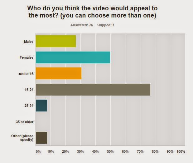 A large number of the respondents thought that the music video would appeal to females and people aged 16-24, which suggests that some elements of our video would be successful in appealing to our primary target audience. However, a significant number of respondents thought that the video would appeal to those under 16 years old. On the one hand, this means that our video has a wider appeal than intended and is therefore positive feedback. On the other hand, this means that despite the drug references, our video may not have come across as mature as we had intended, which could be seen as negative feedback. In hindsight, it seems that we should have given our video less of a 'poppy' feel and made it slightly darker to successfully target our intended audiences.
Nearly 30% of the respondents thought that the video would appeal to males, which we found was generally true from the responses shown below.
 |
| Click to enlarge |
From this feedback, it is evident that members of our secondary target audience enjoyed the video. The above respondents are all males aged 16-24, two of whom enjoy dance music. The feedback was positive, with the respondents rating their enjoyment of the video highly and all having the opinion that it would appeal to 16-24 year olds. However, one of the respondents commented that the Alice in Wonderland footage did not look great, suggesting that we had not reached this audience with the nostalgic appeal of old Disney film footage as we had intended to. Another respondent suggested that we could have used strobe lights or lasers in the performance scenes to improve it, but these were not available for us to use in our production. However, looking back, I think we could have used brighter, white spotlights to imitate the look of strobe lights and lasers (instead of softer, coloured lights) in order to better target our audiences.
 One question we asked people was which section of the video they felt was the most prominent. From the responses, I learned that the paint fight scene was the one that really stood out for most people. As it was just one part of the narrative that stood out, this suggests that the other sections lacked prominence and therefore it seems that we should have tried to keep the montage more equally weighted between the two main narrative set-ups to make them both as memorable as each other.
Despite questions such as the one above providing data that is quick and easy to read, I learned the most from the questions that collected qualitative data as people gave reasons for their opinions. For example, the question "What do you think worked well in the video, and what would you improve?" provided us with detailed feedback. Here are three people's answers:


Reading the responses to the survey, I found that there was some ambiguity surrounding the narrative of the video as a few people said they didn't understand it (demonstrated by the answers shown below).


This may be because, as one respondent to the survey pointed out, the white scenes at the start "could have been a bit longer make the narrative clearer". On reflection, I agree that spending more time setting up the storyline at the start would have made the rest of the narrative much clearer. However, due to the timings of the song this was not possible, which is why we decided to cut the white scenes short.
Despite this, there were also some positive reactions to the narrative of the video, shown in these responses (below) to the question "Did you understand the narrative? Could you explain it?".


This suggests to me that we were successful in conveying the narrative of the video as each person in the answers above seems to get the gist of what was happening. For example, they understood the "balloons and paint stuff" was a portrayal of the lyrics 'My Head is a Jungle', and that it is all happening in her head which is a "mess". The last response is extremely positive as they summed up the outline of the narrative in one sentence. This shows that, for at least some people, the narrative was easy to follow.
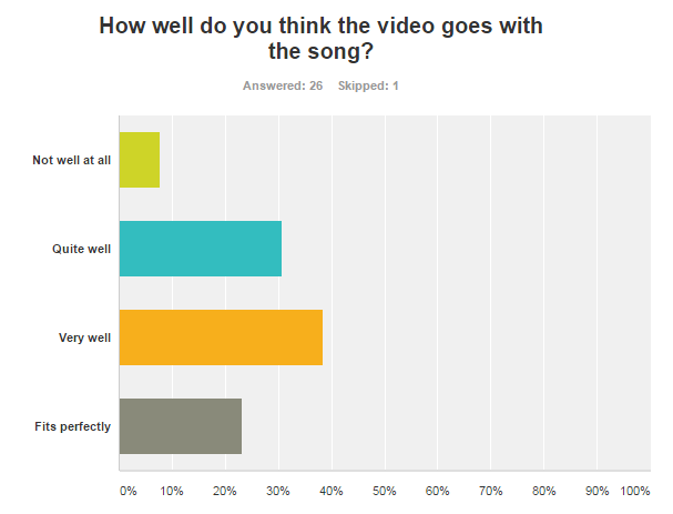 Of all the people we asked, a majority thought that the visuals fitted with at least "quite well" with the song. This suggests that we connoted the genre of the song and interpreted the lyrics well. However, about 10% of the respondents to the survey thought that the video did not fit well at all with the song, suggesting that it was unclear to some how the visuals linked to the lyrics, the music, or the genre of the song. We did frequently cut to the beat when editing our video, however, I feel that we could have made our video more stereotypical of the dance genre by making the sets less bright and colourful, so perhaps this is why a section of our audience felt that the song did not go with the video. Also, if we had interpreted the lyrics of the song more literally, the visuals may have made more sense.
Website and Digipak
After we had produced the final version of our website and digipak, we asked a group of people from each of our three target audiences for feedback on the two artefacts. Here is what they had to say:


In conclusion, the audience feedback we received throughout the construction stage was incredibly useful as it gave us an insight into the tastes of our target audiences, rather than our own personal tastes which we had to stop letting bias our decisions. Our post-construction feedback was also useful as it made me realise how we could have better appealed to our audiences. However, it seemed that the appeal to our intended target audiences was successful in some ways, which was also helpful to learn from the feedback, as it meant that generally we made the right choices and decisions to target these audiences.
Subscribe to:
Posts (Atom)