


The word cloud below contains some words describing the image we strived to create:
As Dyer states, an artist's image is not restricted to their music. He argues that this is because a 'pop star' and a pop performer are not the same thing, as a 'star' is an artificial persona created by the industry to sell a product. Although Lucid City is not a pop artist, the same principle still applies as we have made choices to create a particular image for the artist to sell their music to particular audiences.
Click and drag the mindmap to view the branches: Mind Map created by d08mamac with ExamTime
Dyer's theory tells us that many audiences find pleasure in consuming products that follow a formula of codes and conventions to create something that is of a recognisable genre. We took this into account when producing our music video album cover and website by following conventions of the dance genre. However Dyer also says that it is important to provide something fresh for the market, and so while we followed genre conventions, we also created a unique image for our artist. We did this by using the following features:
Colour scheme
Disclosure use the same colour scheme across their album cover, website and videos, which is what we have done by repeating the same colour scheme of blue, pink and white across all three artefacts. We picked this colour scheme as we felt that the stereotypically feminine pink would help us appeal to our primary target audience of 16-24 year olds females,while the stereotypically masculine blue would maintain the appeal of our artist to our secondary target audience of 16-24 year old males.
The collage below contains examples of where we used this colour scheme, including our album cover, website banner, merchandise, and lighting for the performance scenes of our video (hover over the images to enlarge them or click to open in a new tab).
Iconography: Powder paint
The main iconography we used in our video was powder paint, which we incorporated into all three products. This is used to create synergy across the three texts to increase the effectiveness of the campaign. The picture below shows all the ways we used powder paint.

The repeated use of powder paint is similar to Disclosure's repeated use of drawing of faces over the artists. Our main reason for doing this was to create strong branding, but we also felt that the image of powder paint would help appeal to out primary and secondary audiences of 16-24 year olds. This is because it creates a festival-like vibe as powder paint fights are becoming a common activity at festivals such as the UK's 'Secret Garden Party'. Richard Dyer argues that if the audience share the artist's cultural values it makes them more likely to buy their products, and so if part of the band image is that they enjoy festivals, this may be attractive to our primary and secondary target audiences because as many festival-goers are in this age group, it appeals to their lifestyle.
Other Festival Iconography
As well as powder paint, we used other references to festivals in our music video and website. This creates a fun, festival-like brand for our artist as the image remains consistent across the two texts. Here are some examples of the ways we have linked our artist to festivals.
 |
| Festival-style bright coloured/patterned costumes and party atmosphere in the balloon scene of our video. |
 |
| Festival themed competition on our website. |
 |
| Tour dates for our artist are mainly festivals. |
However, the only festival iconography we used on our album cover was the powder paint, and so to make our artist's branding stronger we could have used more references to festivals, for example dressing the Naomi and the DJs in festival-like clothes for the photos inside the album cover.
 |
| Click to enlarge |
Influenced by Disclosure, we used the same font on our album back cover and the website (right). We also used the same font for the title on our album cover, the banner on our website and the logo on our merchandise (below). Like our use of powder paint, this is used to create synergy and increase the strength of our branding.
Blurred effect

We used a blurred effect both on our album front cover (above) and in our music video (below). This is another way of creating synergistic branding, as it becomes recognisable and unique to our artist. This is similar to the way the overlayed drawings of faces that Disclosure use on their album cover and website, and in their videos have become part of their band image as it is unique to them.

Publicity shots
We created synergy between our music video and publicity shots by taking photos of the artist in the same costumes and sets as in the music video, as well as having other costumes and set-ups that were unrelated. This creates a link between the music video and our website, where the pictures are posted. It also adds to the fun identity of the artist as having these photos as publicity shots implies that their playful personalities aren't just an act for the narrative of the video, but their real personality.
 |
| Promo shots and corresponding scenes from the video |
As well as the texts working together to create and image for the artist, the combination of the three products makes up a strategic marketing campaign. The websites acts as a hub for this campaign, as it converges all the products into one platform where the video can be viewed and the music can be bought.
As the point of this campaign is to sell Lucid City's, we included lots of opportunities on the website to purchase the album. These included both physical copies of the album for sale and digital download options through either iTunes or Amazon to maximise sale possibilities.

As well as encouraging visitors to buy the album, we included other purchasing opportunities. This is because we know from Richard Dyer's star theory that the audience will often respond to elements of the artist's persona by spending money on things such as concert tickets and merchandise. We included the opportunity to buy both of these on our website.
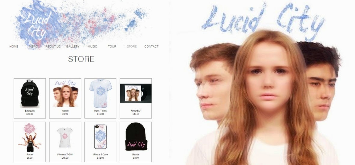
 |
| Merchandise for sale on our website |
 |
| Tour dates with a 'buy tickets' option |
We included tour dates that visit festivals and clubs as another way to appeal to all three of our target audiences. For example, we included Fabric, a club which is popular with young people to appeal to 16-24 year olds, and Outlook, a dance music festival to attract fans of the dance genre.
...
Our main method of marketing the product to our primary and secondary target audiences of 16-24 year olds was via our artist's Facebook and Twitter pages, as teenagers frequently use social media websites so this seemed to be the most effective way to reach them. We posted an update to inform the pages' followers that the album was out and a link to the music video to encourage them to buy the album.
Another reason we made social media accounts for our artist was to create a way for them to interact with fans, giving them a more authentic image, because as Dyer's star theory states, it is important that the audience believe the artist identity is real in order to connect with them and encourage them to buy the product, therefore maximising profits.
We made our album cover the profile picture of Lucid City's page on both Facebook and Twitter to encourage even more sales of the album.
The Facebook page also contains a link to the website to direct followers to the platform where the album and other products can be bought.
 |
| Lucid City's Facebook page |
 |
| Lucid City's Twitter page |
Overall, I think we managed to create a strong sense of branding across our main product and ancillary texts, using synergistic links between to maintain a consistent image for our artist. In addition to this, we chose our marketing strategies to specifically target the three audiences we were aiming to appeal to, and in combination with the synergy of our products this allowed us to create an effective marketing campaign.
No comments:
Post a Comment