


Before we began to design our own album artwork, we researched the conventions of existing album covers. We found that they tended to have one striking image or focal point, often (but not always) the title of the album and the artist name, a theme throughout every panel of the album to create branding, and industry necessities such as the barcode and copyright information.
We decided on a few main features we wanted for our album artwork, such as sticking to the colour scheme of our video, involving powder paint in some way, and having a picture of the artist on the cover.
Next, we began to think about the design of our album, taking artistic influence from a number of existing album covers.
Dance music albums
 |
| Example - Live Life Living Caribou - Our Love Flying Lotus - You're Dead SBTRKT - Wonder Where We Land |
.
Other inspiring albums
 |
| MGMT - Oracular Spectacular San Cisco - San Cisco Vampire Weekend - Contra |
 |
| Paramore |
These are our first rough plans for the design of the front and back cover of our album artwork:
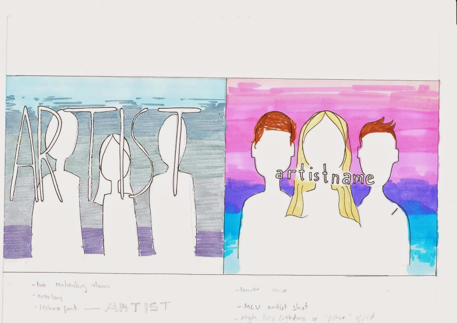 |
| Front cover: two possible variations |
 |
| Back cover |
The image of a group of friends in a forest on the back is the same place the powder paint fight will take place and is meant to create synergy between our video and the album, the same way the powder paint colour scheme will.
 For the inside cover, we plan to have a photo of our female artist blowing powder paint across the two panels, similar to the image to the right. In our shot, the paint will be the same colours as our colour scheme with a white background to emphasise the vibrancy of the colours.
This colour scheme is something that we plan to use across our video, digipak, and website to create a strong sense of branding for our artist's debut album, which is a technique used throughout the music industry.
No comments:
Post a Comment