


 The first step in creating our album cover was picking the most suitable pictures of the artists for the front cover. The image we wanted to create was over-layed pictures of Georgie in the middle with the two DJs facing outwards, producing an effect similar to the cover of Robin Thicke's Blurred Lines EP cover (right).
Picking the best shots
For the image of Georgie this wasn't hard, as the lighting, framing and pose in each photo was of a good standard. We settled on this image of Georgie:

Choosing shots for the DJs was slightly harder as we had two angles to choose from:
 |
| Facing out at a 90 degree angle |
 |
| Facing out at a 45 degree angle |
Layering the images
To assemble the images we used photoshop to cut them our from their backgrounds, layer them on top of each other, and change the opacity so that the DJs could be seen through Georgie.

However, we realised that it didn't look as professional or effective as we ad hoped, so we decided that the image would need more editing to make it visually pleasing.

Our choice for further editing was to blur the images. This made them flow into each other better, and conformed to conventions of albums of this genre, by using heavy effects on the images. To do this, we layered two more copies of the image of each person on top of the existing image, and changed the opacity of each so that the images underneath could still be seen through them.
Title
As we had planned to use a picture of powder paint to fill our album title, we wanted a font that made it look as if it has been hand-written with the powder paint. We settled on the font shown below as it worked for this. We filled it with powder paint by creating a clipping mask for the text on photoshop and layering images of powder paint behind it.
 |
| Font for the title |
Early versions of the front cover
The first version of our album cover looked like this:

Feeling that it looked a bit plain, we tried laying textures over the image to make the cover more interesting and eye-catching. Here are the results:


We used a laser-style texture to fit with the genre of dance music.
However, after asking our audience for feedback, we discovered that they preferred the original cover to the covers with textures. This is because it felt to them as if there was too much going on, and detracts from the blurred effect that they liked. Therefore, we decided to stick with the style of our original album cover.
Back cover
When researching conventions of album back covers, we took influence from the back cover of a Disclosure album, as they make music of a similar genre to our artist.
 |
| Disclosure album tracklist |
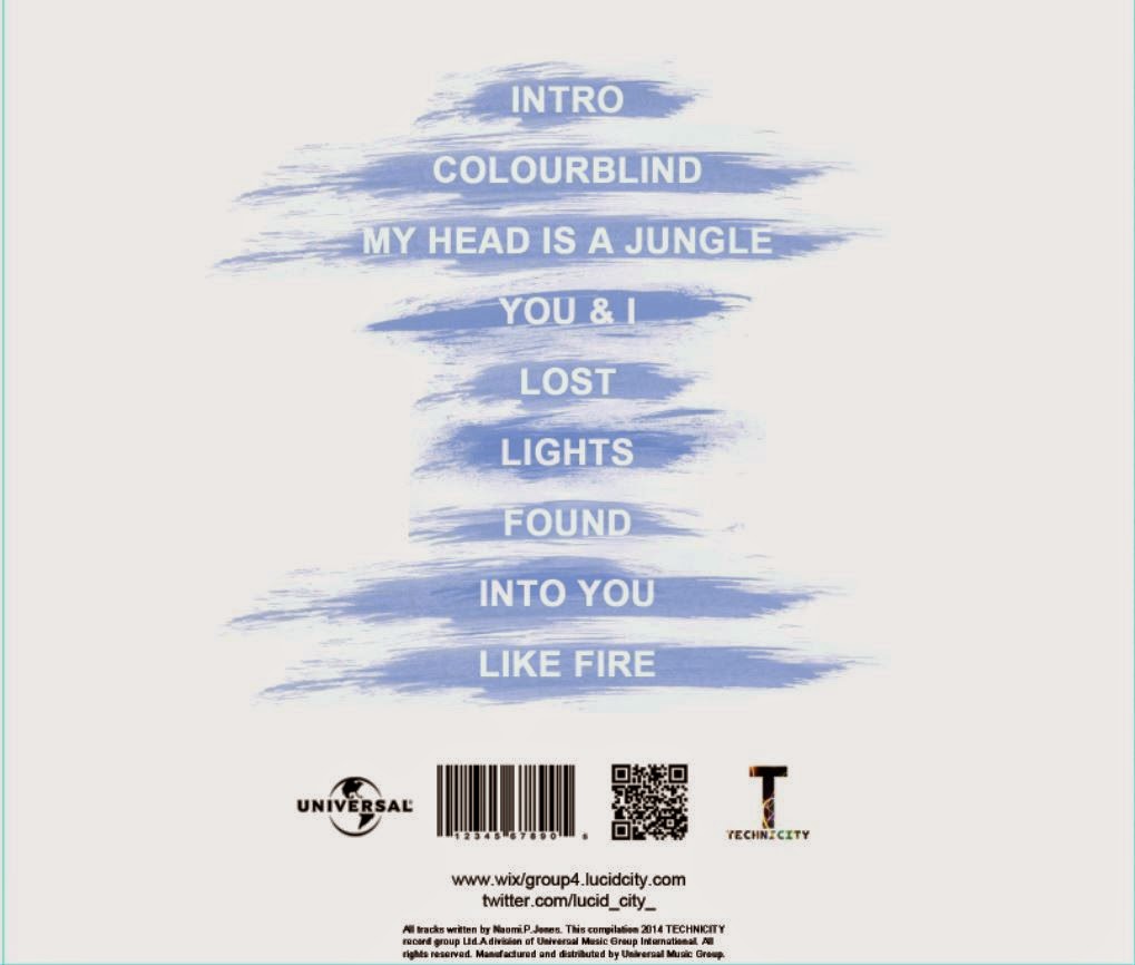
We learned from this that the back cover is often plain and simple, and ties in with the theme or colour scheme of the album as a whole. Using this information, we created the back cover for our album. We kept the background plain just like the rest of the album, and used a particular brush to create paint-like smudges behind the track titles, creating a link between this and the powder paint used in the title on the front cover. The result is below.

Having realised that the brush we used also created grey boxes around the smudges, we increased the brightness and contrast of them to get rid f these. This also created a nicer blue, and one much more similar to the colour of our album title. We then also added a QR code to go alongside the barcode and record label logos, as these are industry conventions.
This is the finished version of the back cover of our album:
Final front cover
To add the final touches to our album cover, we changed the colour hue and contrast to make the image less pink. After making the banner on our website and the track titles on our album blue, we also decided to make the colour of the title completely blue to create synergy with these other elements. We also felt that this represents our artist better as the two males in the band, and the "not too girly" character of our female lead would be represented by the stereotypically masculine colour.

Inside panels
To keep with the minimal theme of our album, we chose to have pictures of our artists against plain white backgrounds across the inside panels of our digipak. Below are the images we picked.

Our finished digipak looks like this:

No comments:
Post a Comment